10 Tips on How to Choose Wallpaper
Amy Krane | November 15, 2017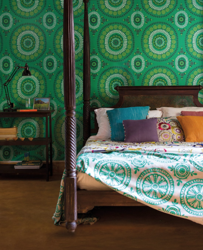
Choosing wallpaper can be daunting. It’s a bigger commitment than choosing paint color because of its expense and removal process. Chances are you’re going to keep it longer than you would a paint color so you really need to be sure about your choice. Apply the following systematic approach to picking the right wallpaper for your home and it should be smooth sailing.
What to consider when picking a wallpaper
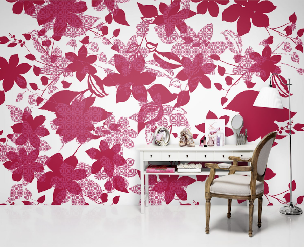
1.Every item in your home pays homage to its identity. Each piece tells another bit of your story. Nothing telegraphs a story faster than wallpaper. It covers a large expanse and sets a tone right away. Ask yourself, “What story do I want to tell?” Are you looking for whimsy, elegance, fun, sophistication, historical reference, cultural identity ? Choose a paper which contributes to the story you want to tell.
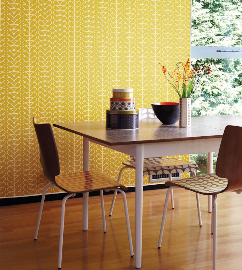
2. Just like choosing paint, the color palette of the wallpaper helps create the mood and ambience in a room. Cool colors: blue, green and violet are soothing for most people and visually recede, making a room feel larger. Dark colors add drama. Warm colors: red, yellow and orange add excitement to an environment. Light colors create a feeling of expansiveness and space. What kinds of colors do you like and what works for the room in question?
What’s trending in wallpaper for 2018?
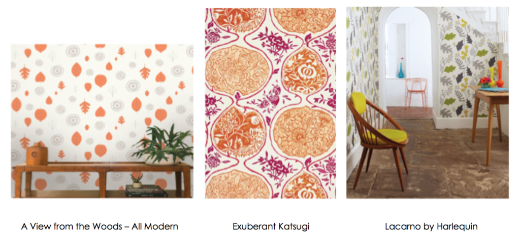
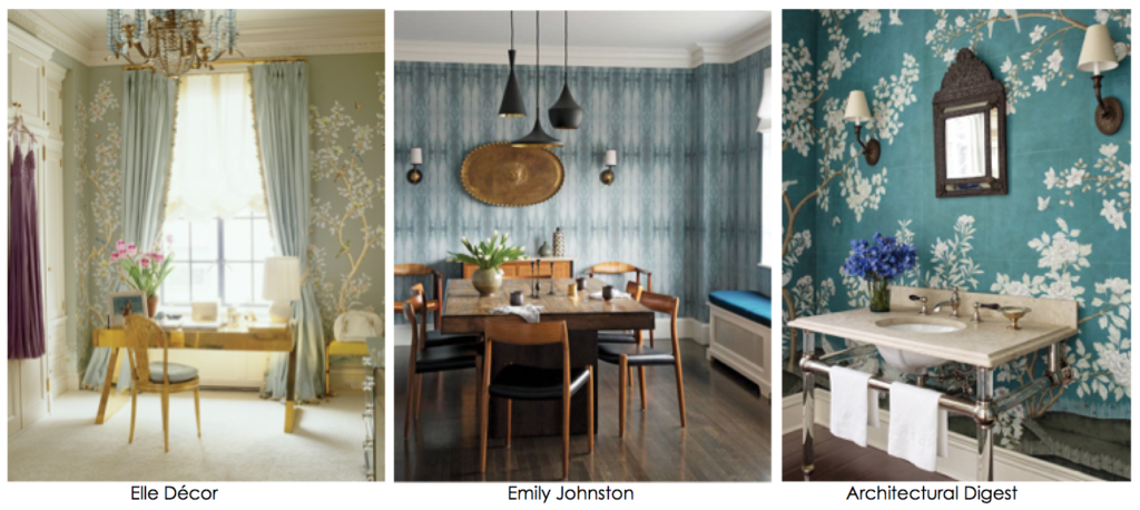
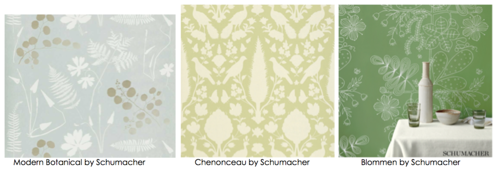
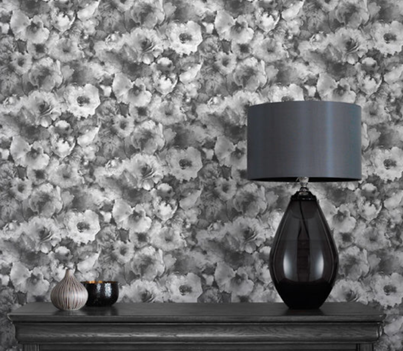
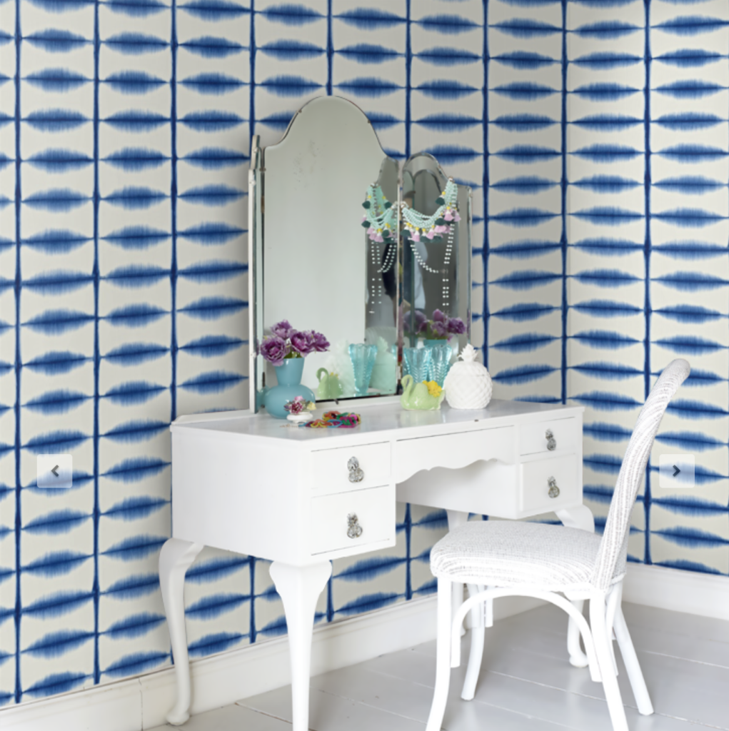
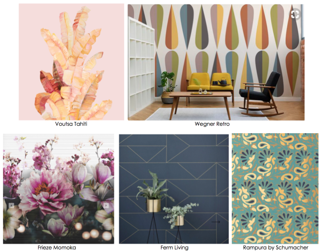
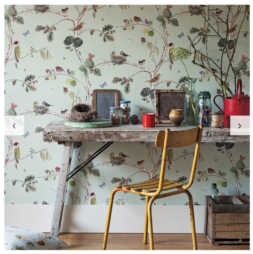
3. What kind of pattern appeals to you? There are so many different styles . Right now botanicals, geometrics, hand drawn & whimsical, folkloric, metallic, chinoiserie and global patterns are some of the most popular styles out there. Black and white prints are also trending at the moment as are metallics.
4. Remember scale is very important. Small rooms will do better with small or medium size prints. Large rooms with medium or large prints. Large scaled patterns may make a room appear smaller to some degree. Vertical stripes will enhance the perception of height in a room and horizontal, width. If you like mixing patterns be careful to vary up the scale of all of the patterns in the room.
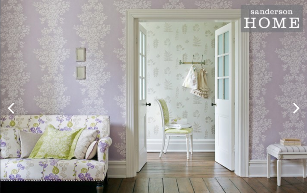
5. Think about the function of the room and choose accordingly. In a bathroom be careful about water splashing and consider a backsplash for your sink. Dining rooms with a chair rail can utilize wallpaper above the rail. In a bedroom consider wallpaper on the headboard wall if papering the whole room seems too much. A long hallway which is dim will benefit from a bright or light wallpaper or use it at one end.
6. Order swatches. They may take time or cost a bit but they’re so important to make sure you’ve chosen a pattern and color that’s right for you.
7. Get creative. Don’t want to paper a whole room? How about one wall as an accent or a fireplace wall, a headboard, a cabinet interior, a bookshelf interior, a drawer, a closet, a ceiling?
8. If pattern feels too bold consider something neutral like a textured paper, perhaps a neutral grasscloth or a metallic textured paper. Textured paper will help cover wall imperfections. Places to try a bold print is in a powder room or other areas you spend little time in.
9. Embrace new technology. Digital printing has allowed custom wallpaper creation. Customers can send hi- res digital images to fabricators and have wall murals created for them. Removable adhesive wallpaper has ushered in new wallpaper options for apartment dwellers.
10. Pay a professional to hang it. Don’t risk a costly mistake.
This post was originally published on Amy Krane Color, and is reposted here with permission. Learn more about Amy Krane Color and their color consulting services.

Read On, Reader...
-

Jaime Stathis | February 15, 2024 | Comment The Hudson Valley’s First Via Ferrata at Mohonk Mountain House
-

Ryan Keegan | November 28, 2023 | Comment Hunter, NY: Full Circle
-

Ryan Keegan | October 17, 2023 | Comment Ellenville’s Next Chapter
-

Joan Vos MacDonald | September 28, 2023 | Comment The Reinvisioned Livingston Manor Fly Fishing Club