Exterior House Colors
Amy Krane | May 9, 2016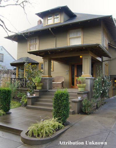
Exterior House Colors
It’s Spring and everyone’s thoughts turn to painting their house exterior. But how do we choose exterior colors?
Painting your home is a major investment and it’s meant to last a decade. The things to consider when choosing exterior house colors include: the style of house, the color palette of the homes immediately surrounding it, the region of the country, home owner association rules, if applicable, the direction the house is facing and the colors of fixed elements like the roof, masonry and hardscape around the home. Those factors considered, there will still be a wide choice of different colors and design approaches to choose from to create great curb appeal.
Many color palettes for house exteriors have been around for hundreds of years and others are newer on the scene. The same color palette will look and feel completely different depending on the architectural style of the home. Take white.
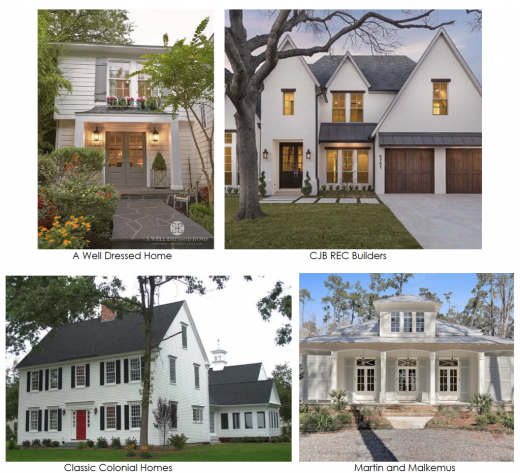
White Houses
Look at the examples below. Three homes have white clapboard but the house styles vary widely. Two have pale gray shutters giving the overall appearance a very subtle, soft look. One is the classic colonial with black shutters and a red door and one is a modern tudor with metal roof and stucco siding. The use of wood stain adds a warm organic quality to the palette. The 4 houses present quite differently.
Earth tone houses
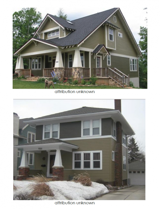
Many house styles work well using earth tones and greens borrowed from nature. These tones blend beautifully with the environment. Arts and crafts houses and prairie style homes are known to use these colors to great affect.
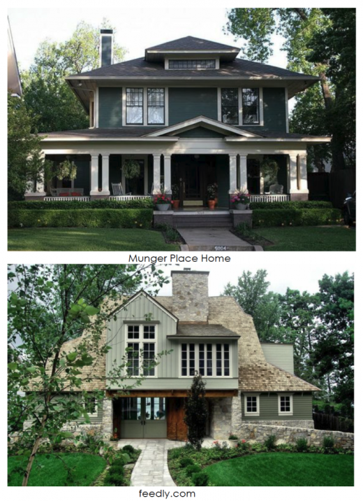
Homes which are divided by a belly band splitting the top and bottom sections of the house can easily employ two different colors for the body of the house. Note the two homes below. They are painted the same colors. Both have craftsman details. The two tones used are close in saturation and value (intensity and lightness) but the olive green is darker. Common practice when painting a home detailed this way is to to put the darker color on top. This is the opposite of the natural order where the dark solid earth is in the lower half of our field of vision. This approach “caps” the house, keeping it solidly grounded with the heavier color on top. The other home looks good, but different.
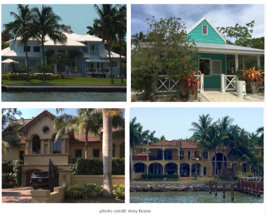
House Colors in the South
Down south, architectural styles differ greatly from up North. Wood is used less due to the heat, humidity and insect population. Stucco is common. Very pale exterior house colors get washed out by the sun and warmer tones are common. Pinks, golds, yellows, sand & adobe colors are everywhere. When a cool color like blue is used it looks best bright and saturated like the turquoise below, creating a tropical look. Note how washed out the light blue house below looks while the turquoise sings.
Black Houses
What’s really new is the growing use of black and charcoal gray on house exteriors. Most commonly used on modern homes they are starting to appear on almost every style house. The look is arresting. Black appears austere and formal when there is no contrasting trim. Adding white trim and/or a brightly colored door looks more friendly and approachable. Either way, it’s a sophisticated color choice.
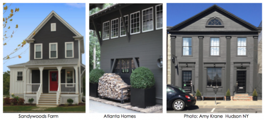
Mixing black with cedar shingles and exposed wood also softens the look.
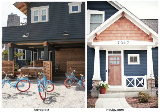
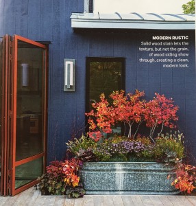
A more quirky house color choice is mid tone or dark blue. Though sometimes considered a fugitive pigment, changing over time, dark blue houses look crisp and inviting and mix well with white or brightly colored trim and doors.
Ask your painter whether they recommend stain or paint for your home. There are advantages and disadvantages to both. Paint chips and peels over time but creates a more durable and protective coating sitting on the surface of the house. Stain sinks into the substrate. It doesn’t need priming. All stains differ from paint in that they provide color yet, at the same time, allow the wood’s character to show. A “solid” product is the most opaque and allows texture, but little grain detail, to be seen. A “semi-transparent” product allows some grain to be seen; a “clear” will show the most grain. Keep in mind that the more transparent the product, the more its color will be affected by the underlying wood; so, variations in wood color will be more obvious with transparent products, as will any natural blemishes such as knots and tannin. Also, opaque products usually last longer because they block out a greater proportion of damaging, ultraviolet rays. There are many decisions to make when deciding on your exterior house colors. Make sure to test colors on the house first, painting very large swatches of color in areas of shade and direct light before investing. Colors appear lighter outside than they do indoors.
For more from Amy Krane, visit her website here.

Read On, Reader...
-

Jane Anderson | April 1, 2024 | Comment A Westtown Barn Home with Stained-Glass Accents: $799.9K
-

Jane Anderson | March 25, 2024 | Comment A c.1920 Three-Bedroom in Newburgh: $305K
-

-

Jaime Stathis | February 15, 2024 | Comment The Hudson Valley’s First Via Ferrata at Mohonk Mountain House