A Look to 2017: 10 Design Trends
Amy Krane | December 16, 2016
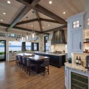
Photo by Mike Baker
While it’s been a tumultuous year politically, design trends spotted in 2016 and even before, continue to manifest. Warm metals like copper and brass abound, pinks of all types continue to appear as sophisticated wall color choices and dark tones are showing up everywhere. Live edge wood used in everything from tabletops and shelving to bed frames continues to be featured in shelter magazines and homes alike.

Amanda & Chris’s Air BnB
Purple
A deep jewel purple, Shadow is Benjamin Moore’s 2017 Color of the Year. Mid-toned violets like PPG’s Violet Verbena and Olympic’s Cloudberry made the top list as well. Perhaps purple’s association with mystery will help transport us to another, more pleasant time, if only emotionally. Purple has got appeal for many applications. A room with lots of natural light will help it sing.

Bleached Wood Floors
The choice of bleached, pickled or gray washed floors continues to dominate wood floor tones. Used in conjunction with deeply pigmented walls the combination is irresistible. Note 3 of the 4 photos above show the trend. Even wood floors laid in herringbone or parquet patterns are going this route. It’s a more, rustic, unfinished look borrowed from influences like Scandinavian design and the Boho look, prevalent last year.

Wallpaper
It’s true wallpaper eased back into use a while ago but it’s here full tilt now. Used in powder rooms and bedrooms before, it’s beginning to appear in hallways and foyers, living rooms and restaurants. Pattern continues to engage and delight the senses as one of the coming year’s most exciting design trends. Last year we saw a real uptick in the use of patterned cement floor tiles. While that trend continues, pattern is everywhere on the walls now.

The Modern Farmhouse
If I’ve heard it once I’ve heard it a thousand times this year. Many people who own single family residences are looking for the modern farmhouse look. What exactly is it? It’s shiplap, (horizontal paneling), predominantly white or light Scandinavian cool colors on the walls, painted built-ins in the pantry and mudroom, shaker or inset kitchen cabinets and drawers, an airy modern clean feel with warm touches from rustic beams and organic materials like wood floors.

Fixer Upper

Tone on Tone
One of the first things one learns training in the field of color is to vary up the contrast, LRV (light reflectance value) and color temperature when choosing hues for a room. This tone on tone look defies good visual ergonomics and healthy color practice but it’s out there and catching on as one of the newest design trends. The look is monotone and therefore (seemingly) soothing and sophisticated. Too much time in a room like this can cause eye fatigue from the monotony but there is certainly a contingent that finds it glamorous and au courant.

The Camel Leather Sofa
From moderately priced purveyors like West Elm to Room and Board, Mitchell Gold + Bob Williams and beyond, everyone is selling it. It’s clubby without being stuffy, informal and sexy. While leather often appears masculine it’s being used in rooms with a more feminine twist as well. The more aged, scuffed and worked in like an old pair of boots, the better.

Dark(er than the walls) Trim
Colonial homes were often decorated this way and it’s back. Generally less applicable for modern or contemporary homes, in more historic venues with wide and decorative trim it’s becoming more common.

Michael S. Smith
High Gloss Painted Ceiling
For a few years now we’ve seen designers creating glamorous rooms in homes, clubs and restaurants using high gloss paint on all 4 walls. This kind of paint finish creates a highly reflective space which can be uncomfortable and it requires perfect walls as the gloss shows off every bump. This year we have started to see gloss on the ceilings with matte walls. Depending on how much natural light in the room, the kind of artificial light, the amount of hard surfaces in the room, how the floor is treated and the color of the walls and ceilings, it may or may not work.

Blue, Green and all in between
While neutrals continue to be the most commonly employed colors for dwelling interiors, and purple is the new “it” color per the paint companies, there is no doubt that blues, greens and the hues in between are making a splash. Pantone hit the nail on the head with “Greenery” as their new color of the year. You can’t pick up a shelter mag or take a peak at Pinterest without noting the interest in these colors. Known as soothing and/or refreshing their application is appropriate for any decorating style. As people have moved away from the all white kitchen and even the grey kitchen, we’re noting a prevalence of cabinets in deep greens, mid blues and teals. This year’s bleached wood floors, camel leather sofas and even modern farmhouse vibe all work with this palette.


Design Trends : Black Accents
Let’s face it, black is sophisticated. But it’s easy to go overboard so the key is to use it as an accent. Make sure to add touches of warm colors to the space so it doesn’t come off sterile. Incorporating black into a room adds instant contrast and a graphic quality to the decor. It’s showing up as kitchen cabinetry, on millwork throughout the house and on interior doors and window mullions. Black window sashes and mullions help the eye move beyond to the outdoors, bringing the outside in.

Well there you have it! 10 emerging and developing design trends for 2017. At Amy Krane Color
we’re looking forward to exploring the home design world with you next year!
If you’re in need of help with interior or exterior color you can find me at amykranecolor.com.

Read On, Reader...
-

Jane Anderson | April 1, 2024 | Comment A Westtown Barn Home with Stained-Glass Accents: $799.9K
-

Jane Anderson | March 25, 2024 | Comment A c.1920 Three-Bedroom in Newburgh: $305K
-
-
Jane Anderson | January 30, 2024 | Comment A Renovated Three-Story Beauty in Poughkeepsie: $695K