9 Sophisticated Color Palettes For Your Home
Amy Krane | June 6, 2016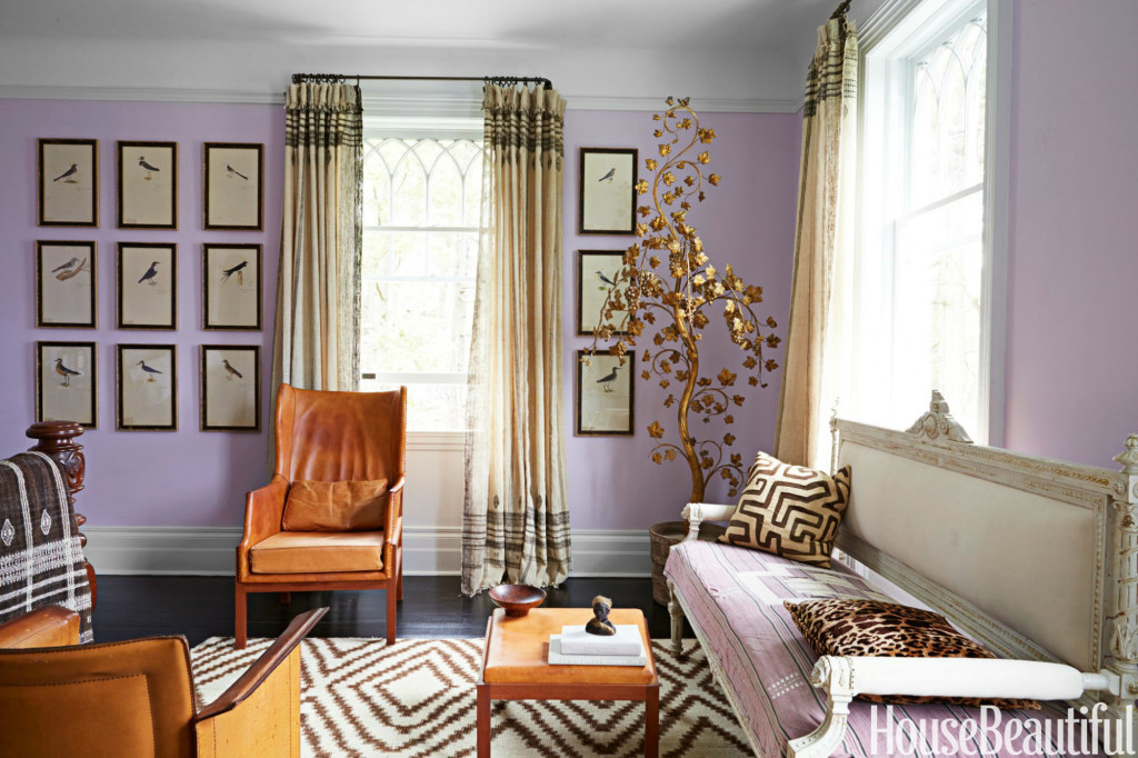
Summer is here and many of us are thinking about painting and redecorating. With 3500 Benjamin Moore colors alone the possibilities are endless. Often people find it difficult to know where to start. While any color alone might be a real beauty, it’s really about how colors combine which create your overall look and feel. Looking for a sophisticated color palette which brings elegance or whimsy to your home? Think outside of the box and be adventurous with your combinations. The living room above from House Beautiful exemplifies this notion. Mixing a warm lavender (warm because the red in its makeup is palpable) with caramel and ecru creates a space which pops with surprise. The warm tones in the cool purple pick up the same warm tones in the leather seating and linen curtains. The gold tree is the final note of whimsy which bring all of the tones together.
You can’t go wrong using complementary colors so beginning with blue and orange is always a winner. It gets more adventurous when the tomato red is added as an accent color. The mix of warm and cool colors together guarantees a dynamic balance to the room’s color palette. Combining muted with brights keeps the overall effect eminently livable.
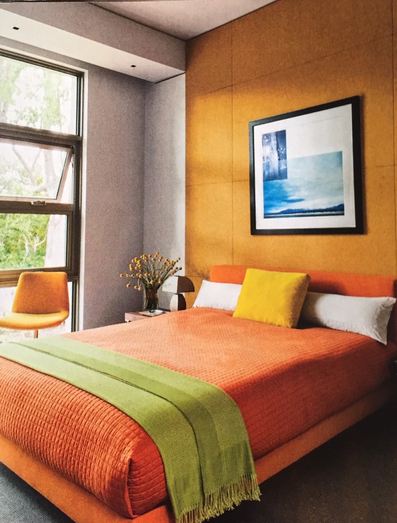
This bedroom is simply exuberant. Without the grey walls and floor it would be too much but tempered by their neutrality, the oranges and chartreuse really sing. Again, employing the complements of green and orange bring excitement to the overall color palette. Using two shades of the same hue is usually a successful way to decorate and both orange and green are two colors which mix with its own very well.
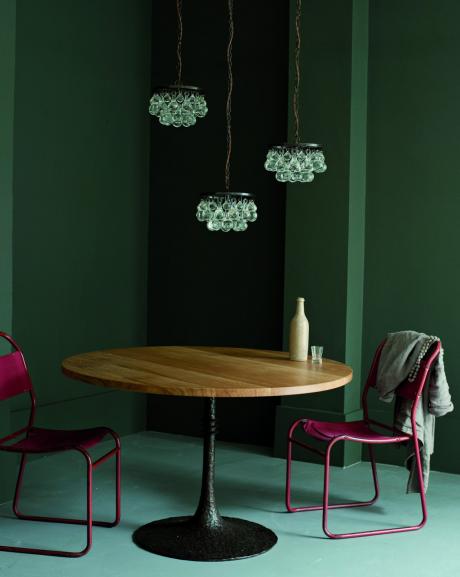
As mentioned before, mixing greens works really well. Why? Because we are very accustomed to seeing many different greens mixed in the natural world around us. Here the deep yellow-green walls play off of the mint green floor. They are electrified and raised out of their relaxing state by the addition of fuchsia. Bravo!
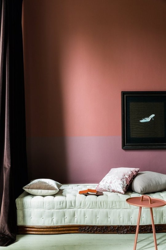
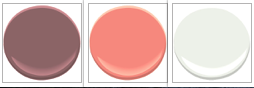
Who would have thunk it? Dusty rose with coral. This is highly unusual and very dramatic. It’s an intense color combination and would not work without the relief provided by the white with the slight green undertone. It gives it all a sense of balance with its lack of hue and cool counterpoint.
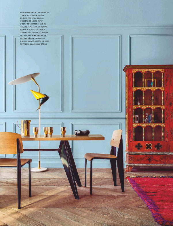
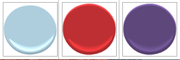
Pastels have gained popularity recently but when they’re combined with other pastels the overall look is insipid. It’s simply not for grown ups. Here baby blue is used as the backdrop to a combination of red and purple. All together it’s smashing. With so much intense color around, the rustic pale wood floors help balance the equation. Red and violet are wonderful partners as they share a common component. Note all of the plaster wall details and moldings are painted the same color as the walls. There’s no need to highlight molding with another color in a setting like this.
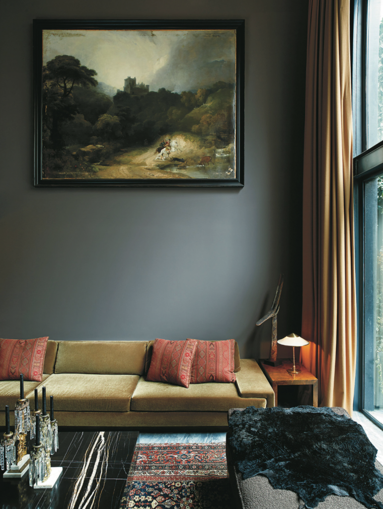
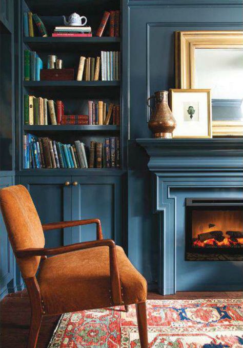
Gray is the still the hottest color for a neutral background. Here this sophisticated palette was created by using a deep gray with green undertones mixed with muted gold and orange accents. The warm colors really pop against the dramatic and moody wall tone. The ambience is elegance and sophistication. Clearly the oil painting was used as inspiration for the color palette. While one should never set out to buy art to match a particular room, using a piece of art as inspiration for a room’s coloration really creates cohesion in a space.
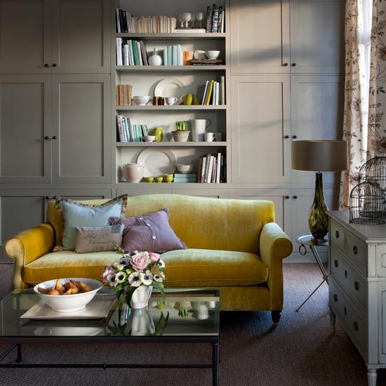
Revere Pewter is one of Benjamin Moore’s most popular colors. It’s a warm gray which sidles up to taupe. Here its warmth is brought out by the yellow sofa which picks up on this undertone. The yellow is perfectly complemented by the cool purple pillow. When using saturated colors it’s very wise to set them against a neutral backdrop like this.
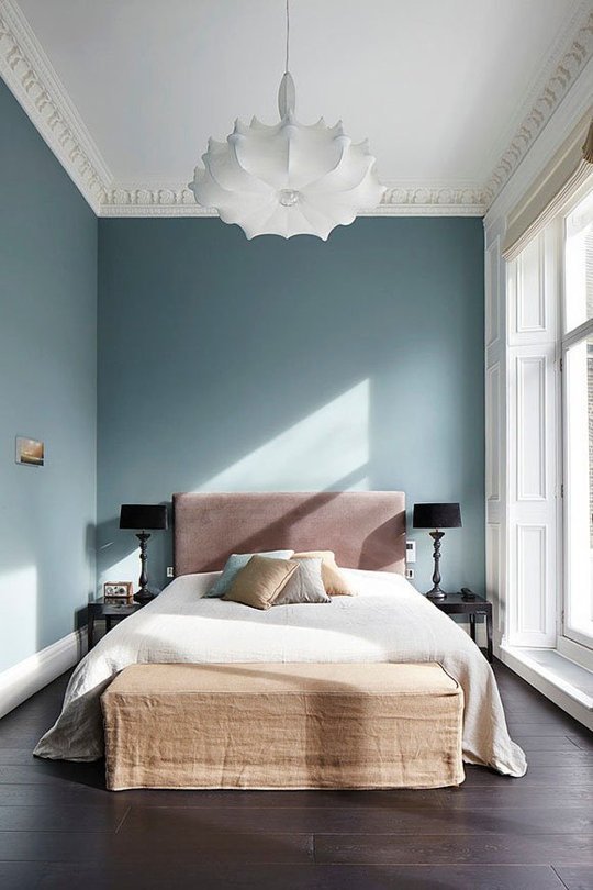
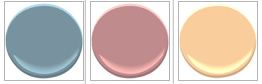
This bedroom is so soothing and spa-like. The key to its success is how muted all of the colors are. Because of their desaturation there is nothing juvenile about the combination. Instead of feeling like a baby’s nursery this is an elegant adult’s space which masterfully mixes cool and warm shades. Soft teal is mixed with dusty rose and pale, washed out coral. Using soft color with relaxed linen textures reinforces the mellow vibe of the bedroom.
There you have it! 9 sublime and sophisticated color palettes which are both unique and beautiful.
For more from Amy Krane, visit her website here.

Read On, Reader...
-

Jane Anderson | April 1, 2024 | Comment A Westtown Barn Home with Stained-Glass Accents: $799.9K
-

Jane Anderson | March 25, 2024 | Comment A c.1920 Three-Bedroom in Newburgh: $305K
-

-

Jaime Stathis | February 15, 2024 | Comment The Hudson Valley’s First Via Ferrata at Mohonk Mountain House