To Color or Not To Color: Be Bold, Not Trendy, with Interior Spaces
Haynes Llewellyn | November 14, 2014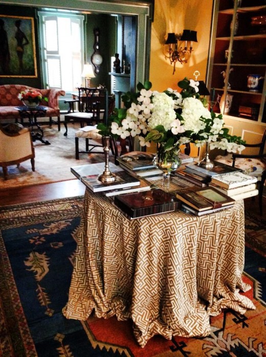
Recently I was asked the question interior designers are asked on a regular basis: Would I consider giving a presentation on today’s trends and tips in design? My initial mental reaction was that the two words I despise the most are “tips” and “trends.” For me, the design of a room as well as the design of any interior should be thought of as timeless. The biggest mistake a person can make is to have their home or apartment designed in accordance with what is trendy or the most current fad. Unlike our clothes, one’s interior is typically not changed every season.
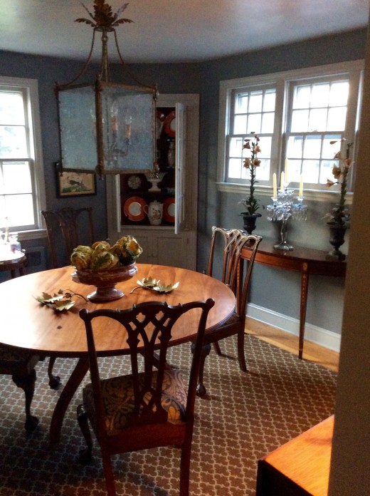
Because my personal and professional interiors are noted for my use of bold, rich colors, I often find myself discussing color choices. The first question I am asked is, “How do you decide which color to use in a room?”
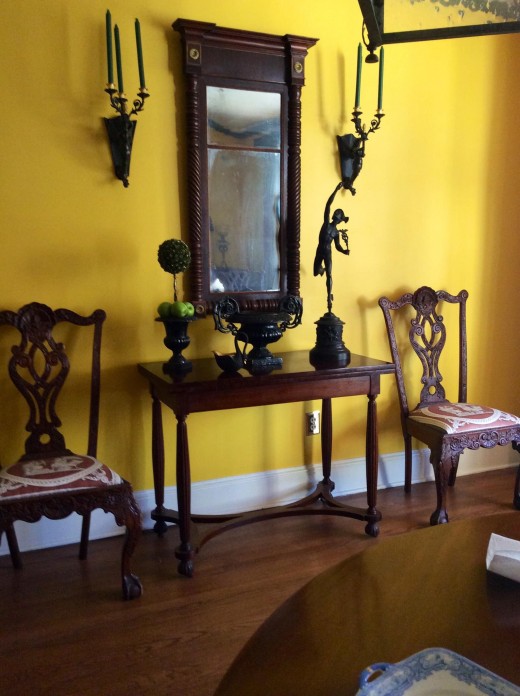
Typically, my inspiration for a room color stems from the client’s art work. It is only natural a room’s color should work with the art that is hanging on the walls. I also believe the room color should coordinate with the room’s furnishings. For example, a yellow room always works best when there are splashes of red and blue incorporated in the overall design. These splashes can be utilized in the floor coverings, window treatments, upholstery and decorative accessories.
One trick I utilize quite often is to add gloss to the paint. Gloss has the effect of deepening the color while simultaneously creating the illusion the walls are lacquered. The late interior designer Billy Baldwin was known for his lacquered walls. But I’ll tell you a secret: His walls were not actually lacquered. He simply added gloss to the paint.
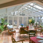
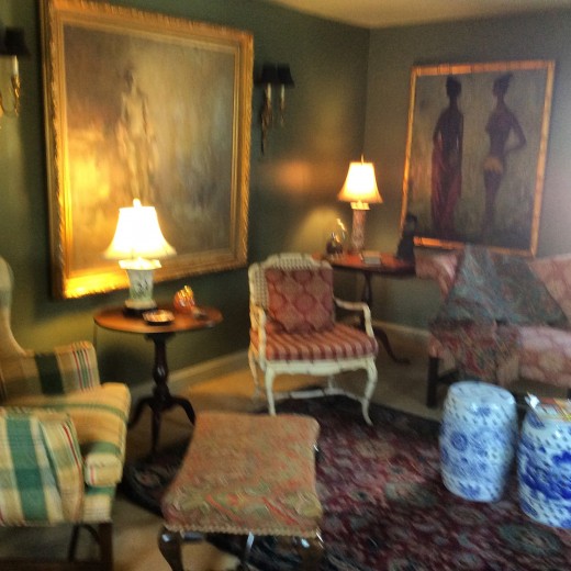
Personally, I find white walls a waste of a great space. I have seen gorgeous white rooms with a pearl finish that I thought were stunning. Yet, for my own palette I prefer rich colors. Even in small spaces I love to use a deep rich color. Deep colors can have the effect of increasing the size of a small room instantly.
My friend and interior designer Brian McCarthy often uses the term “plane of vision.” Plane of vision refers to the natural way your eyes turn when you enter a room. So another opportunity to define a room’s look is the selection of a ceiling color. Even if the ceiling color is vanilla or a very pale gray, depth is immediately given to the room.
My new favorite color is black: black accessories, black upholstery, black woodwork, even black walls. Black, when executed correctly, has the allure of ageless elegance. Red, another of my personal favorites, gives a room power and strength. The Chinese have always associated the color red with power.
Never hesitate to be bold in your color selections. Using bold colors not only enhances a space, it also has the effect of warming a room.