Modernist Holiday Decorating
Amy Krane | December 8, 2014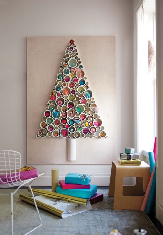
For traditionalists, one highlight of the holiday season is unearthing the ornaments in the attic and decorating the freshly cut conifer. The smell of the fir or spruce adds a hint of spice to the living room air and the flicker of scented candles with the twinkle of fairy lights on the tree add to the nostalgia and romance of the scene. As we all know, green and red is the tried and true color palette for Christmas. For centuries, evergreens have been displayed in the winter home to both decorate and remind of the coming spring. It is hypothesized that the red originates from apples used in Christmas plays about Adam and Eve and hung on early Christmas trees. Also as the holly branch became an integral part of Christmas decoration in many European cultures the red berries came to signify Christmas.
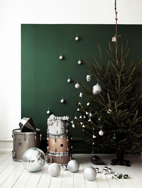
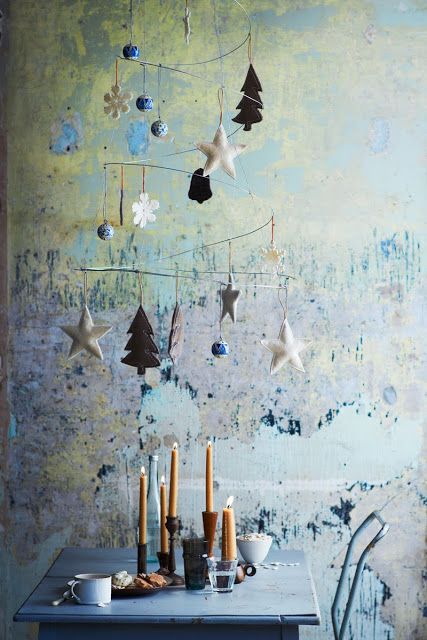
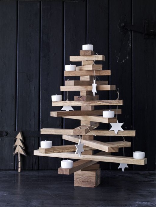
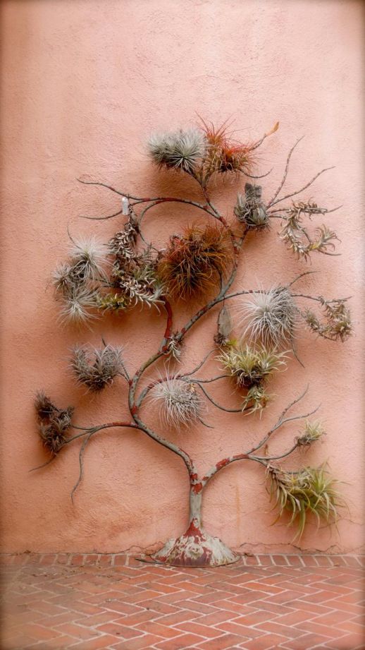
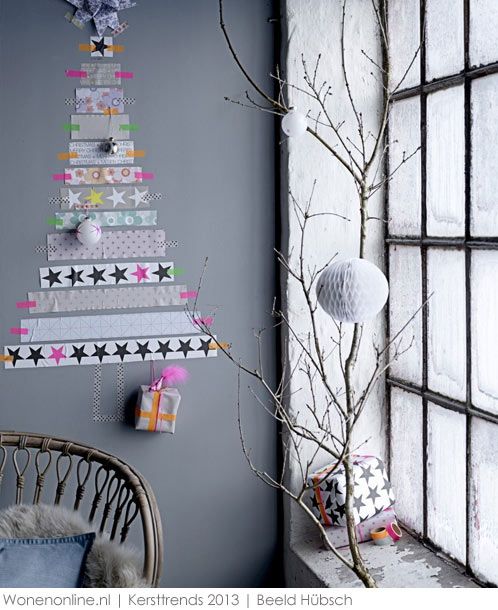
More recently, alternatives to the red and green scheme abound. The gold tree, the silver one, mixed metallics, pink and gold or the all white tree are all popular choices for the slightly more adventurous who are not looking for a cornucopia of color. Like artwork we choose for our home, it’s not about matching some existing color scheme. The tree as well as holiday swags, wreaths and garlands don’t need to “go with” anything. In that respect we might call them “neutrals.”
For many there is no fathomable alternative to bringing a bit of the winter landscape indoors by using evergreens. At a time (for us northerners) when the outdoor landscape is brown (or white), adding the green of plant life is a boost for the soon-to-be winter weary. But for those whose taste runs outside of the typical, a tree made without flora is a chance to stretch one’s imagination. Many with a modernist temperament, often go with a monochromatic theme and even set against a white, black or gray wall, the results are very festive and quite beautiful. If your taste runs more along these modernist lines, take a look at some striking examples of Holiday Color.


Read On, Reader...
-

Jane Anderson | April 1, 2024 | Comment A Westtown Barn Home with Stained-Glass Accents: $799.9K
-

Jane Anderson | March 25, 2024 | Comment A c.1920 Three-Bedroom in Newburgh: $305K
-

-
Jane Anderson | January 30, 2024 | Comment A Renovated Three-Story Beauty in Poughkeepsie: $695K