Pastels in Home Decor
Amy Krane | April 4, 2016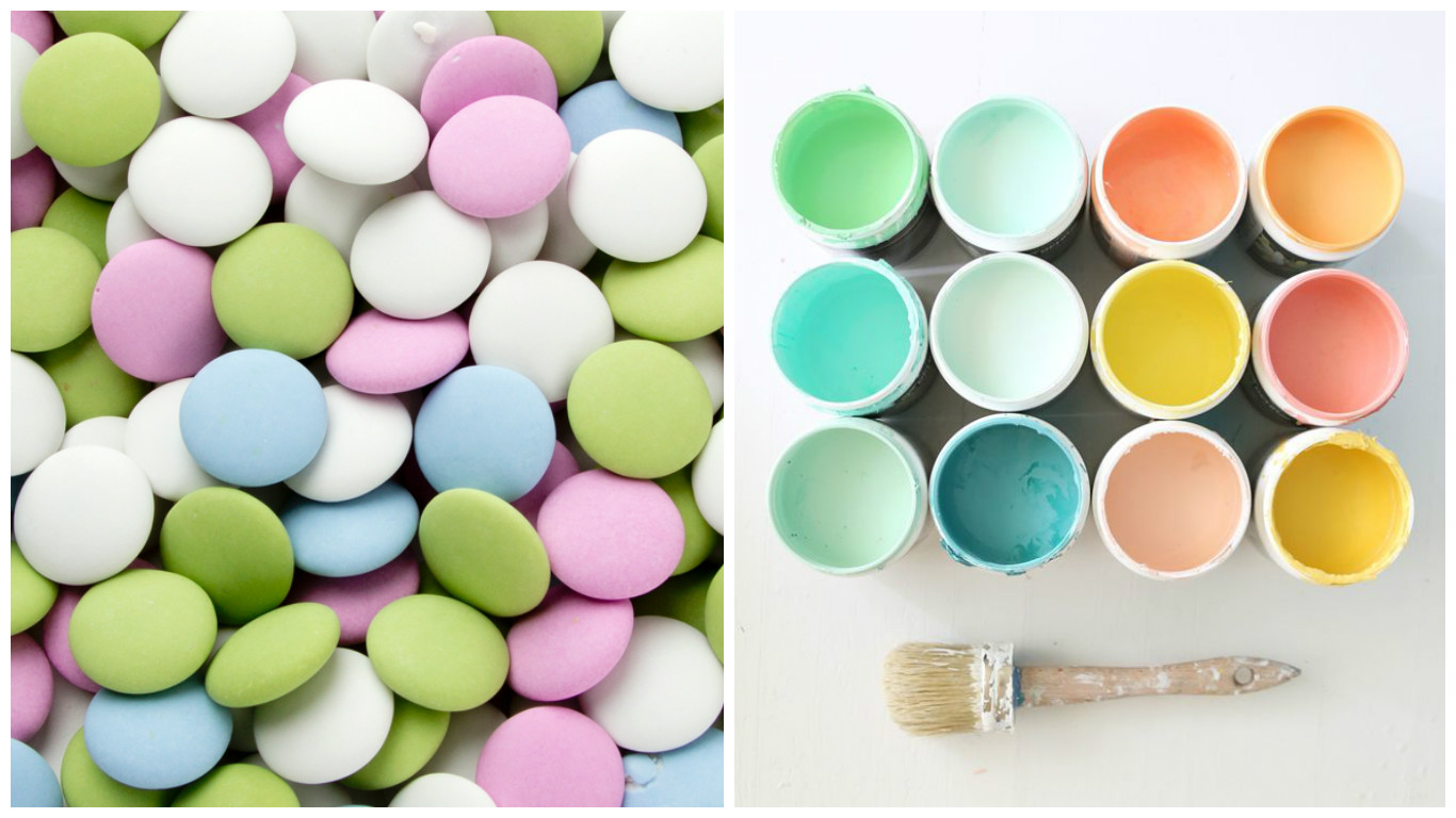
At the mention of Pastels, I think of those gorgeous candies, the nonpareil mint. The cool mint green, the blue-ish pink, the lavender and the baby blue. I can imagine biting into the hard, sweet candy shell with the hint of mint below and the rich chocolate center. I just don’t think about pastel home decor.
But pastel interiors have become a trend. Certainly around springtime. They seem to be everywhere and they are more often than not poorly executed. For some reason when people decide on a pastel palette they feel the need to include too many pastels in the room and the space becomes a mishmash of baby colors, which bears nothing in common with one another other than their lightness of tone. Even for a child’s room, this color scheme is wholly unbecoming. Colors can be described using 3 characteristics: hue ( what color it is), value ( how light or dark it is) and chroma or saturation (how pure it is).
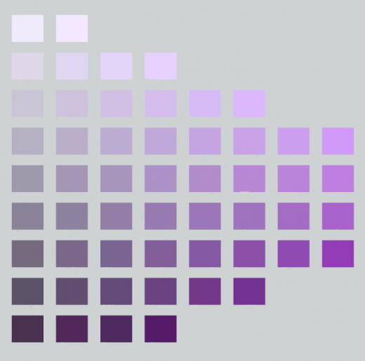
On this Munsell chart the hue is purple. As we move from left to right the color becomes more saturated and less gray and as we move down the color chart the purple has less value as it approaches black. Pastels have high value; they’re very light and approach white, near the top of this chart.
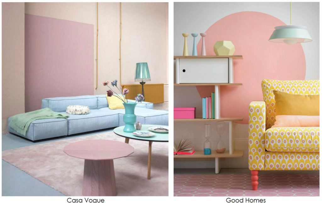
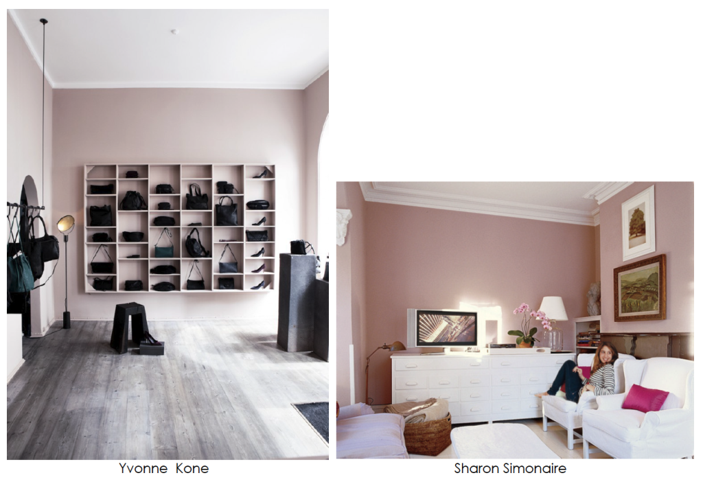
The two interiors above are examples of this strange custom to mix the most common baby tones in one room. The room on the left is least successful because the room lacks any contrast and the colors bear no relationship to one another. There is no relief from the monotony. The room on the right is a slight improvement because the yellow of the chair is more saturated than the other tones and gives the room a focal point. Nevertheless, it is still an example of poor color mixing. Just because the theme is pastels, it doesn’t mean you need to include pink, baby blue, mint green and pale yellow in one room.
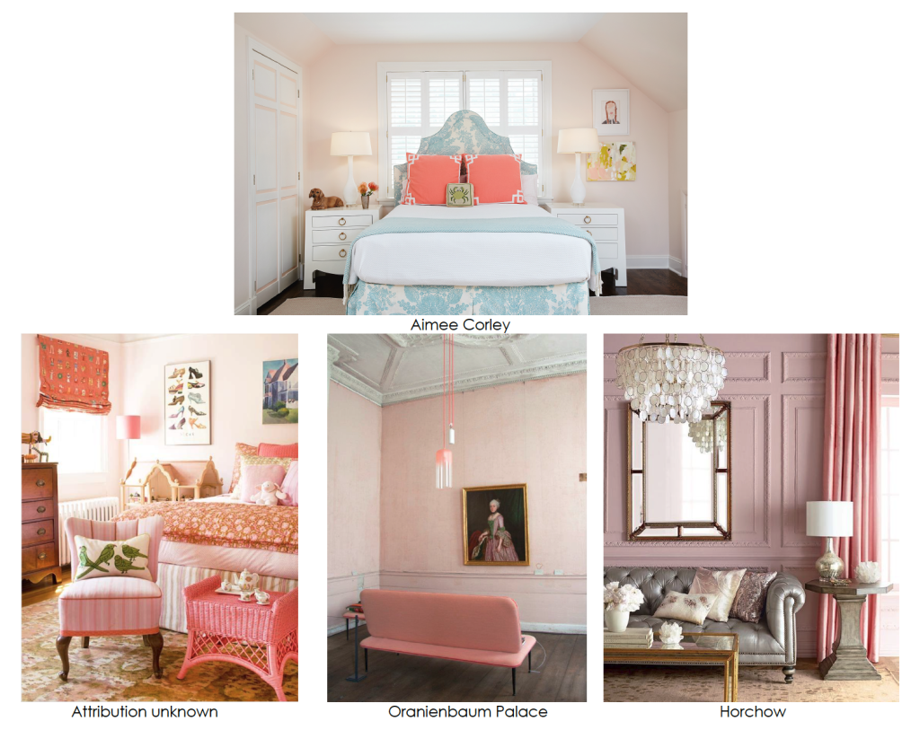
The pink pastel rooms above are much more interesting and adult. Each room mixes one, or two pastels at most, with colors of varying brightness and saturation creating interesting environments. The way to make the pinks more sophisticated is to mute them by adding gray to their composition. Then they no longer have that baby nursery feel.
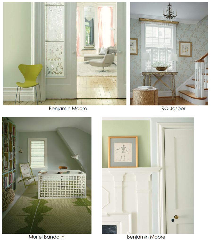
The pastel green rooms above are also well done because they limit the number of pastel colors used and mix the pastels with other colors like gold, white or the brown of wood. The rooms employ elements which vary in brightness and intensity creating spaces which are soft and light without becoming boring.
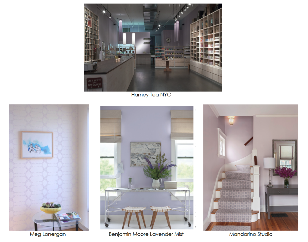
Colors have associations of course and lavender is identified with mystery, intimacy and sweetness. When the shade contains more red than blue it becomes warmer and therefore more cloying and sweet like the pale violet on the right.
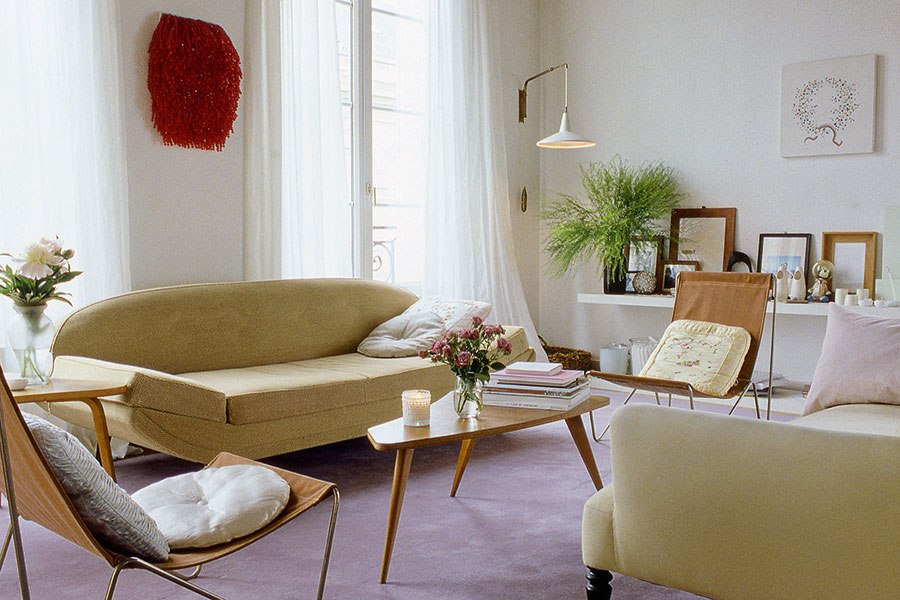
Here are some examples of gorgeous pastel rooms. To create a pastel room of elegance and beauty, limit the number of colors in your palette, use some tones with weight and strength along with the pastels, mute the colors at least a bit, and mix in some neutrals. Then you will have created a very livable space without conjuring up associations of cotton candy or tooth fairies.
For more from Amy Krane, visit her website here.

Read On, Reader...
-

Jane Anderson | April 1, 2024 | Comment A Westtown Barn Home with Stained-Glass Accents: $799.9K
-

Jane Anderson | March 25, 2024 | Comment A c.1920 Three-Bedroom in Newburgh: $305K
-

-

Jaime Stathis | February 15, 2024 | Comment The Hudson Valley’s First Via Ferrata at Mohonk Mountain House