Decorating with Variations of the Same Color
Amy Krane | January 3, 2018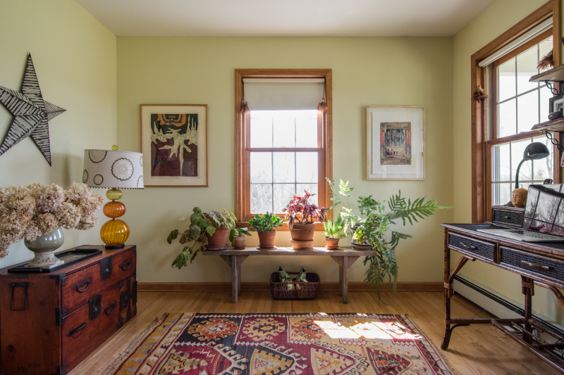
As an Architectural Color Consultant I’m often asked how I know which colors “go” together. One particular design direction, decorating with variations of the same color stumps many people. There is the science and art of working with color. The science is established. Colors can be quantified and measured in many ways. The art has more to do with one’s taste and sensibility. It’s personal. ( I don’t mean private). In the end it’s about who you are and what you like. How adventurous are you in your color tastes? When it comes to being liberal or conservative in one’s color proclivities, either goes, and unlike in politics, people who are one or the other have no trouble sharing the Thanksgiving table!
Color Theory and Decorating
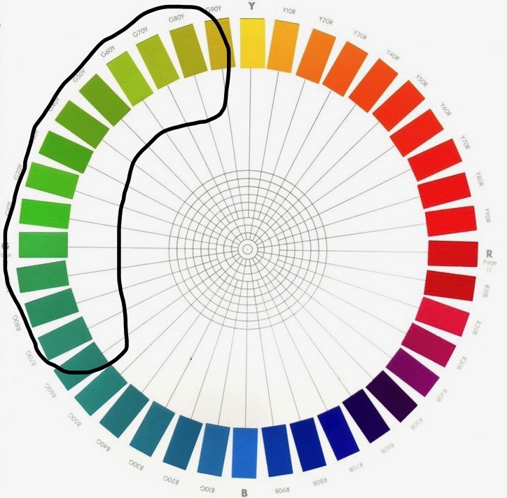
When you mix colors in a space, using color theory helps you choose colors whose relationships are established and minimizes the chance of messing up. Relationships like using analogous hues ( next to each other on the color wheel) or complementary ( colors across from one another on the wheel) are tried and true.
Monochromatic Colors
Monochromatic color schemes use colors from the same hue family together – an all blue room or an all yellow room, for instance. Such a space would likely be perceived as monotonous and relentless for most people. Mixing variations of the same color with neutrals like white, gray or beige helps the eye rest in such scenarios. Incorporating the same exact blue many times over in an otherwise white room will be sedate and fairly unexciting while mixing different blues with white amps up the wow factor. Contrast is so important.
Monochromatic color combinations
Mixing variations of the same color in a room works but you may not like it. On the personal side, I like mixing oranges, greens and blues with themselves, yellow a little less so, reds and purples, not all. But that’s about my personal taste only. To some people’s eye these combinations clash. To others, they are interesting and compelling. Be careful when combining neutrals from different parts of the color wheel. Brown grays and blue grays don’t mix well nor do yellow and pink beiges. You need to be mixing colors which have enough saturation (purity) to be perceived as distinct hues if you’re going to attempt mixing variations of the same color and ignore what’s commonly referred to as their undertones. (Actually overtones, but let’s not get too technical!)
Universally accepted is mixing different greens. Why? Because we are accustomed to seeing this all around us in nature. It’s completely familiar and natural and this makes the world of difference.
Mixing Different Greens
To me, mixing greens is as natural as a walk in the park. You just don’t question its authenticity. The mind’s eye accepts the wide variation of greens as harmoniously co-existing in the environment.
In the photo above we see many kinds of green, both yellow green and blue green. It feels right. No thoughts of “clashing colors” here. And as long as there is another color (red above) in the setting there is nothing monotonous about the combination.
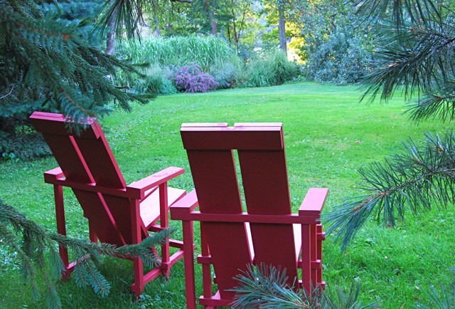
In the architect designed home below, the window frames are almost black and recede from consciousness, sending the viewer’s eyes outdoors and bringing the greens of nature into the room. The ambiance achieved is one of delight and refreshment. But if your home is not graced with large picture windows you can achieve this look anyway.
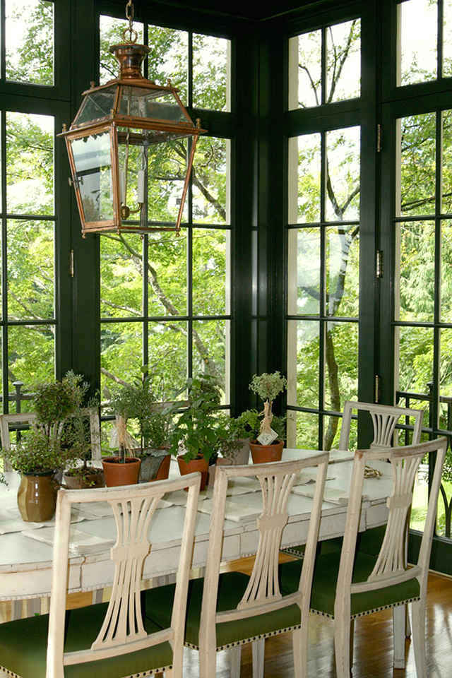
Photo: Amy Krane
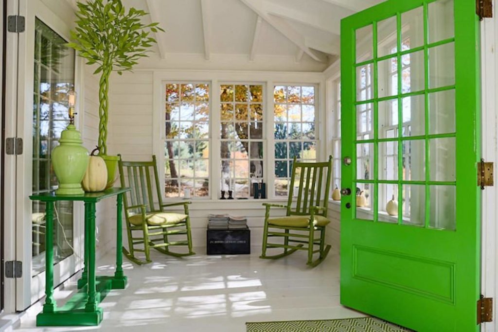
Below, Hawthorne, the Hudson Valley country home of Ted Sive and style writer and design doyen Ted Kennedy Watson, founder and creator of the eponymously named Kennedy Watson lifestyle stores, mixes greens to great effect. Using white as the counterpoint to the bold greens the owners’ achieve both excitement and balance at once.
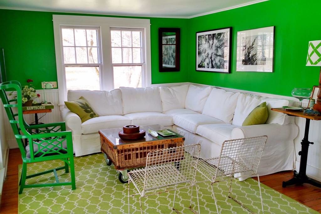
The mix of greens is very stimulating. As none are muted it makes this choice even more bold. These are highly invigorating, saturated tones of green which would overpower without all of the white. The atmosphere is upbeat and sophisticated. The color combination is so unique the experience of visiting is unforgettable.
You may not have the confidence or inclination to decorate your whole house this way but rest assured if you do, mixing greens will create an environment of beauty.
This post was originally published on Amy Krane Color, and is reposted here with permission. Learn more about Amy Krane Color and their color consulting services.

Read On, Reader...
-

Jane Anderson | April 1, 2024 | Comment A Westtown Barn Home with Stained-Glass Accents: $799.9K
-

Jane Anderson | March 25, 2024 | Comment A c.1920 Three-Bedroom in Newburgh: $305K
-

-

Jaime Stathis | February 15, 2024 | Comment The Hudson Valley’s First Via Ferrata at Mohonk Mountain House