Life Is Like A Box of Crayons, and I Love To Color
Haynes Llewellyn | July 8, 2015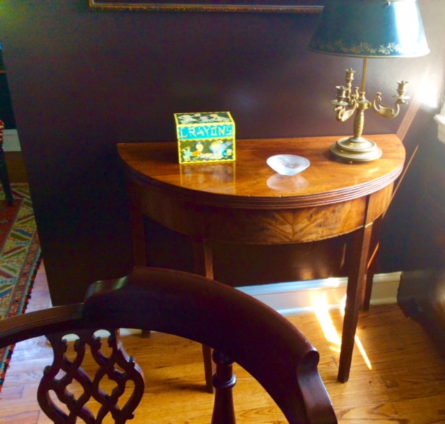
“I paint from the top down. From the sky, then the mountains, then the hills, then houses, then the cattle, and then the people.” – Grandma Moses, Artist
To a degree there may be a correlation between paint and crayons. Close your eyes for ten seconds and think of your favorite color from your childhood crayon box. Was it Purple, Green, Brown, Black or white? Now think if you have utilized your love of your favorite crayon color in the selection of clothing, cars, upholstery or paint. In the film Forrest Gump, Tom Hanks famously remarked, “life is like a box of chocolates.” I always say, “life is like a box of crayons, and I love to color.” As a child I can remember my first crayon boxes. First I had the basic set, then the expanded version, and finally the fifty-color set. I enjoyed coloring to such an extent that from an early age I was given a special crayon box to house my crayons. I can remember brilliant golds, five shades of red, deep greens, lush purples, deep browns and black. White, though was always my least favorite of the colors. Unless drawing snowflakes, coloring snowmen or lining the blues of clouds I never used my white crayons (and for the record I did not necessarily always color within the lines).
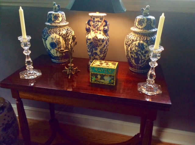
As my collection of crayons grew, at an early age I was gifted with a crayon box.
Color memory and a love of color have been keystones of my design career. Bold colors juxtaposed with antiques, accessories and contemporary art is my personal design mantra. After touring our apartment in Manhattan a neighbor ruefully commented, “you are not afraid of color are you!” In a word, no. I have always believed with proper thought and selective choices any color may be effectively represented and conceptualized.
In his book At Home, Bill Bryson discusses the evolution of houses throughout the centuries. “When paints became popular, people wanted them to be as vivid as possible. The richer a color you could get, the more you tended to be admired. Suddenly, George Washington and Thomas Jefferson come across as having the decorative instincts of hippies, “a rather startling realization of our forefathers.” Bryson concludes, “when the first ready-mixed paints came onto the market in the second half of the nineteenth century, people slapped them on with something like wild abandon.” Again it seems we have returned to the crayon box. There is an old saying, “the world laughs with flowers.” It’s a laughter accentuated with color.
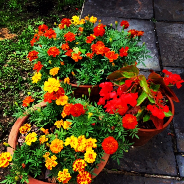
The earth laughs with flowers in a multitude of colors
In an earlier feature I posed the question: “To Color or Not to Color?” The feature focused upon color choices for a home’s interior. This week I am taking the discussion out into the great outdoors, as I discuss the usage of color on the exterior of your home. Having just completed a color transformation of the exterior of our own home, this is indeed a timely topic. Have you ever accidentally hit your thumb with a hammer while installing artwork or completing a carpentry project? The immediate, “ouch” is suddenly replaced by a dull throbbing pain. When Gary and I purchased our current 1930s colonial revival, my immediate reaction to the home’s austere white clapboards and barren landscape was similar to banging my thumb with a hammer: ouch, throb, throb. Every day throughout the winter months as we rounded the bend to our home there it was, the throbbing thumb. The season’s snow and ice further emphasized the coldness and austerity of the home’s exterior. Everyday I would exclaim to Gary, “are you positive you can not paint the exterior in sub zero temperatures?” (Naturally I realized you could not).
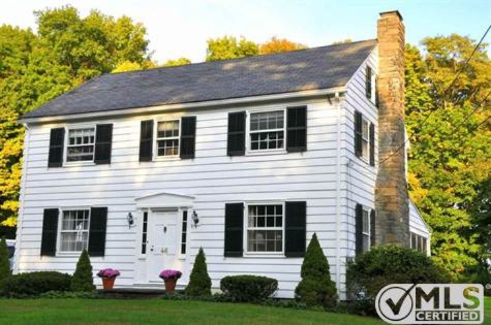
The listing of our 1930s colonial revival, with its austere white facade
A rather oversized house positioned on a slight hill, it began to resemble the saltine cracker boxes of my childhood; white and stark. As the snow began to melt and the torrent of dangling icicles came crashing down, my mind began to dance with possibilities, for I literally had a huge blank page upon which to color. I wanted a color somewhat rooted in the colonial period, but not a color devoid of character. Most of the homes in my neighborhood (there are eight) are 1920s or 1930s adaptions of Federal or Classical American architecture. Predominately the neighborhood is comprised of homes set back from the road with gracious manicured lawns and shrubs. Each home has a distinctive usage of color on the body of the house as well as on architectural trims, pediments and shutters. Naturally, I wanted a distinctive color that complimented my neighbor’s houses yet maintained the architectural heritage of our home.
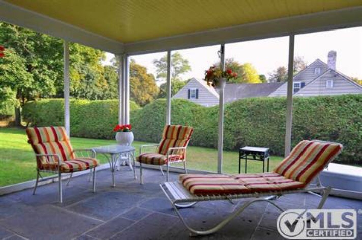
The white columns of our summer porch were like barricades to the landscape beyond its perimeters
Shutter color is always a cinch; raised in the South I have always favored Charleston Green for shutters and subsidiary doors. Basically, Charleston Green is Exeter Green paint mixed with Flat Black. Personally, I always prefer that shutters have a sheen. The sheen allows the shutters to glisten in the sunlight in every season. Realizing my predominant desire for a bold clapboard color, a subtle off-white – Ivory Lace – was selected for the trim. Similar to my childhood coloring days, white again became an accent color. I have a thing about front doors and front door colors. To me a front door provides an initial statement about your home, one which proclaims, “this is our home, and this is its character: Welcome!” The warmth of a home’s entry instantly embraces visitors as they step upon your threshold. In the charming seaport town of Stonington CT, 18th and early 19th century homes feature doorways splashed with purple, green, blue, red and yellow (again, back to the crayon box).
During a recent business trip to DC, Gary suddenly burst into our hotel room in a rather odd fury. “I have found the paint color for the house, you have to come look.” My initial thought was, “either the aliens have landed or he has smacked his head.” To know Gary is to understand he basically only humors my interests in color or design. He is by no means the next male version of Dorothy Draper (Dorothy Draper was a 20th century Interior Designer, famous for her use of bold colors and pattern). After surveying the exterior of a home in D.C.’s Chevy Chase neighborhood, I agreed a subtle mustard yellow would definitely be transformative to our home’s exterior. Subsequent visits to the Hudson Valley’s magnificent Boscobel further confirmed my decision. (Boscobel’s exterior is similarly painted a mustard yellow.) Yet, I still felt I had not identified the correct hue of mustard. I wanted a bold color, which harkened to the brilliance of the hand-hewn pigments of the 18th Century. Then, bingo! By selecting a gold from Benjamin Moore’s Williamsburg Interior Collection I had found the perfect color – more often than not interior colors may be mixed in exterior form.
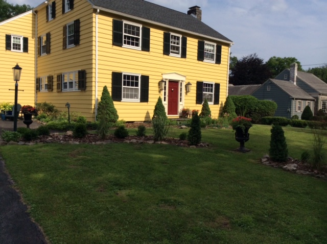
The exterior of our home is no longer austere, no longer a stark white.
Then we were off to the races with our exterior painting project. The colors had been selected, and a palette chosen. The color would transform an austere facade into something more welcoming. Daily life is filled with hurdles, obstacles and victories. I always feel your home should be inviting and comforting: a home whose exterior and interior work together to create a sanctuary or nest. Fortunately (and unfortunately), our home had a few additional exterior Achilles Heels, a useful but unattractive garage shed attachment, an asphalt side terrace and a glorious screened porch, whose commanding aesthetics were an acid yellow ceiling and stark sharp white pillars. The starkness of the porch columns seemingly created a barricade to the lawn beyond its perimeters. The sense of containment was reminiscent of the slide reels of early films.
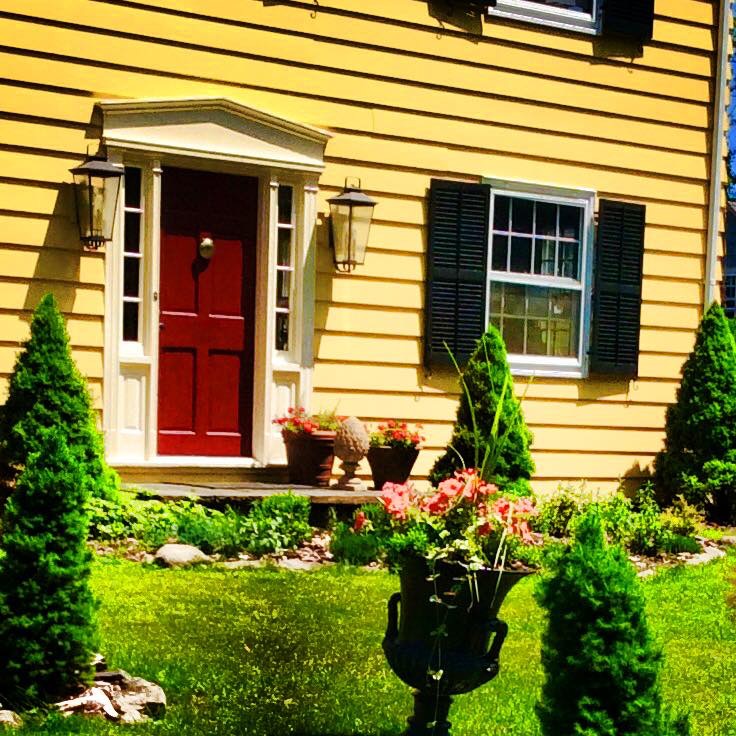
Fine paints of Europe Red, helps to soften the entrance facade, creating a welcoming effect for visitors to our home
After eighteen years and five homes Gary has finally learned to acquiesce to my design decisions, not always out of complacency but of acceptance. Transforming the asphalt terrace was the first task. By purchasing white marble chips and utilizing natural Hudson Valley bluestone as a border a former eye sore became mindful of a French or Italian Garden. The transformation was easy, quick, and affordable. By once again utilizing the mantra, “make the obvious less obvious by making it more obvious,” as my mandate, both the porch and the shed were transformed. For the porch columns and the shed facade, I again utilized Charleston Green. The shed suddenly achieved an appearance similar to the shuttered porches of my Southern youth.
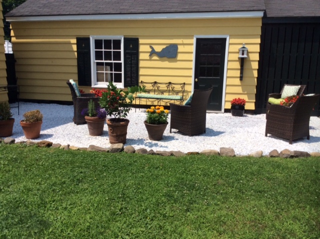
Marble chips trimmed with a bluestone border easily transformed an asphalt jungle into a comfortable terrace, perfect for leisurely pursuits.
By selecting Charleston Green for the porches’ doors, thresholds and pillars, and by choosing a mellow deep sage green for the porch ceiling, an exterior room was created. It was now a space with an instant appeal, a space which is often difficult to leave. Now you might understand why my life is becoming defined by porch conversations. In recent weeks when people ask whether I am in Manhattan, the standard response is, “no, he’s on the porch.”
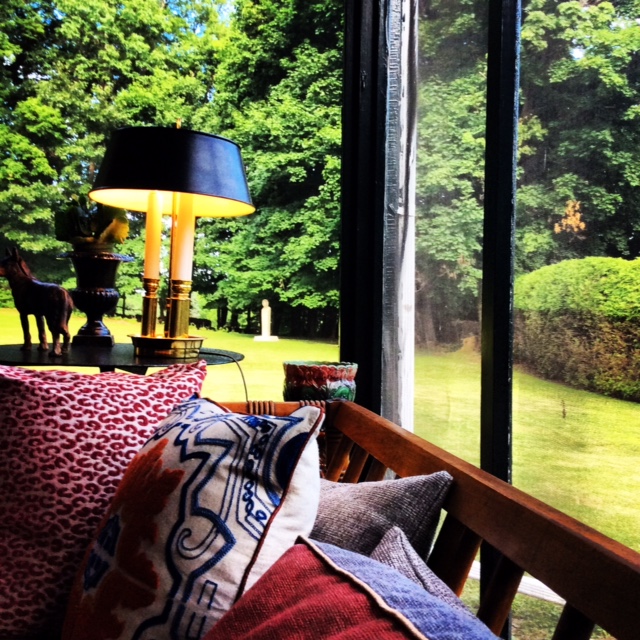
Charleston Green allows the porch columns to blend quietly into the natural landscape
Time and time again I have heard the phrase, “I am just not good with color, I do not know how to work with it.” Yet, I think if people would just close their eyes and reflect upon the crayon boxes of their youth their opinion might change. As children we are taught many things, and we learn on a multitude of levels, but the progression into adulthood blurs these lines. Yet, as individuals we have strong reactions to certain colors. Obviously, I see the world with a multi-colored lens. Flowers color the earth with an array of shades and hues, making it laugh in greens, yellows, reds, oranges and blues. Looking at life as an opportunity to color our homes and our lives is a rather soothing concept. As I said, “close your eyes. Now what were your favorite crayon colors as a child?”
Read On, Reader...
-

Jane Anderson | April 1, 2024 | Comment A Westtown Barn Home with Stained-Glass Accents: $799.9K
-

Jane Anderson | March 25, 2024 | Comment A c.1920 Three-Bedroom in Newburgh: $305K
-

-

Jane Anderson | January 30, 2024 | Comment A Renovated Three-Story Beauty in Poughkeepsie: $695K

